A recruitment app for the maritime industry, serving three different audiences from a single codebase.
A web recruitment platform needed to become a mobile product.
Marineria.it is an established Italian maritime recruitment platform. Ship operators post positions; crew members - deckhands, engineers, officers - apply for them. The business worked on the web, but the people using it don’t sit at desks. They’re on vessels, in ports, between contracts, on phones.
The brief was a native-feeling app for iOS and Android covering the full platform: browsing, applying, and the recruiter-side tooling. One codebase, two stores, two languages.
Three audiences, opposite needs, one app.
Most recruitment apps solve for one side of the market and treat the other as an admin panel. Here both sides were first-class, plus a third group that mattered commercially: people who wanted to look before committing to anything.
Guests needed to browse and filter the entire job board without an account the platform’s supply of candidates depends on it. Crew needed to build a profile once and apply repeatedly with it. Recruiters needed the inverse: search across candidates by skill and location, then make contact directly.
The hard part wasn’t the feature list. It was making three products feel like one, without a mode switch the user has to reason about.
Let the account type shape the app, not a menu.
Rather than a role picker at launch, the app resolves capability from the session and lets each surface adapt. A guest sees the board and a prompt where an action would be. A crew member sees the same board with apply enabled. A recruiter sees the board plus the candidate search it mirrors.
Registration lives inside the login screen instead of behind a separate flow the moment someone needs an account is the moment they’re trying to do something, so the account creation happens there rather than as a detour.
The parts that decide whether an app gets used twice.
Real-time listings with filters that hold their state across navigation, because a candidate scanning a board and opening a role expects to come back to the same list.
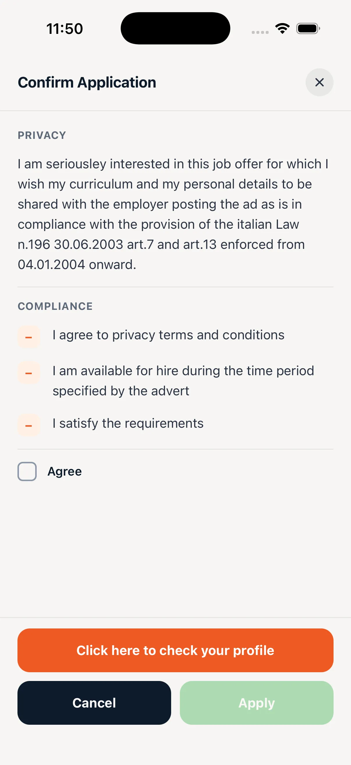
Honest qualification feedback. When a crew member doesn’t meet a position’s requirements, the app says which requirement and why instead of accepting the application into silence. This was the decision I pushed hardest for, and the one most likely to be cut by default.
Role-targeted push notifications: crew are notified when a matching position is posted, recruiters when someone applies. Two audiences, two triggers, one notification layer.
Bilingual throughout, with the toggle in settings rather than a launch-time choice maritime crews are multinational and language preference isn’t a property of the device.
Shipped to both stores, in both languages.
The app went live on iOS and Android with the full platform available on mobile, including guest browsing that requires no account at all. The single-codebase decision held: feature work ships to both platforms at once, and the recruiter tooling did not need a separate product.